Project:
Year:
Type / Category:
Location:
Introduction:
KC Gents Barbershop
2015
Identity, label, packaging, branding
Kigali, Rwanda
The KC GENTS stands for modern masculinity with a classic touch.
The brand embodies the spirit of confidence, craftsmanship, and community — a place where grooming meets gentleman culture. Since
its establishment in 2015, KC GENTS has become more than just a barbershop; it’s a lifestyle space that represents authentic care, timeless style, and trust.
The name “KC GENTS” pays tribute to its clientele — modern gentlemen
who value precision, professionalism, and presentation.
Core Concept
”Modern Tradition” forms the foundation of KC GENTS’ identity.
The design bridges heritage-inspired barbershop charm with a
contemporary masculine aesthetic. The goal was to create a timeless
visual mark that communicates both authentic barbering heritage and
modern grooming excellence.
This concept ensures that the brand resonates with both long-time loyal
clients and new generations of urban men who view grooming as part of self-expression.
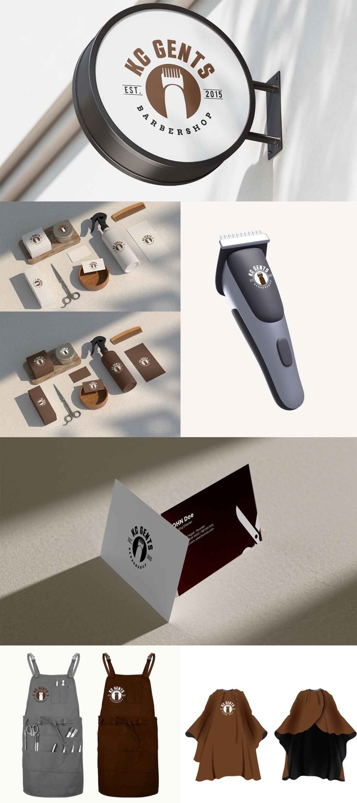
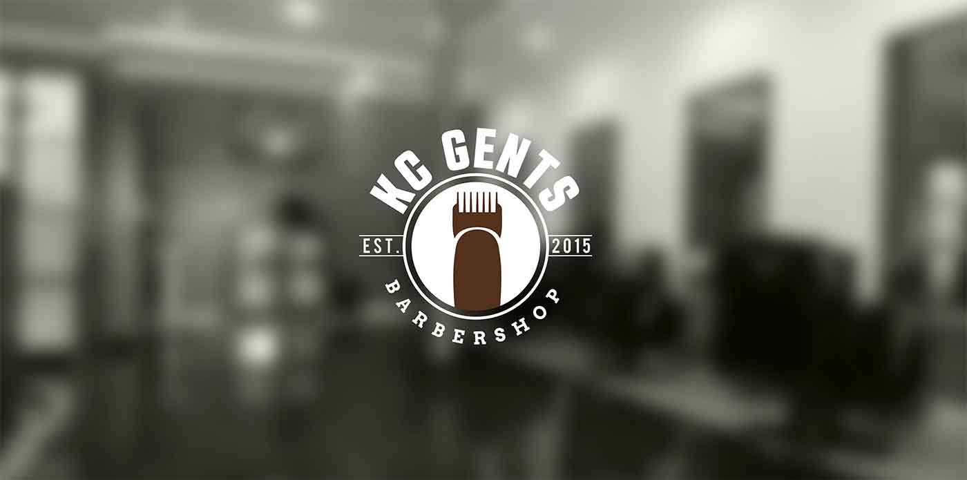
Visual Identity Concept
Logo Design
The KC GENTS logo combines clarity, symbolism, and heritage.
The central clipper icon immediately identifies the industry — a bold,
recognizable symbol of the barber’s craft. It serves as the core emblem of
trust, precision, and expertise.
The circular badge structure conveys unity, professionalism, and
timelessness, reminiscent of vintage barbershop seals.
The “KC GENTS” typography is bold and assertive — modern yet classic
— representing confidence and strength.
EST. 2015 reinforces credibility and legacy, anchoring the brand in
authenticity and experience.
The curved “BARBERSHOP” text below adds balance and rhythm,
completing the badge-like composition that works seamlessly on signage,
uniforms, and digital branding.
Overall, the logo was designed to be iconic, practical, and instantly
identifiable — a symbol that feels equally at home on a storefront window
or an Instagram profile.environment.