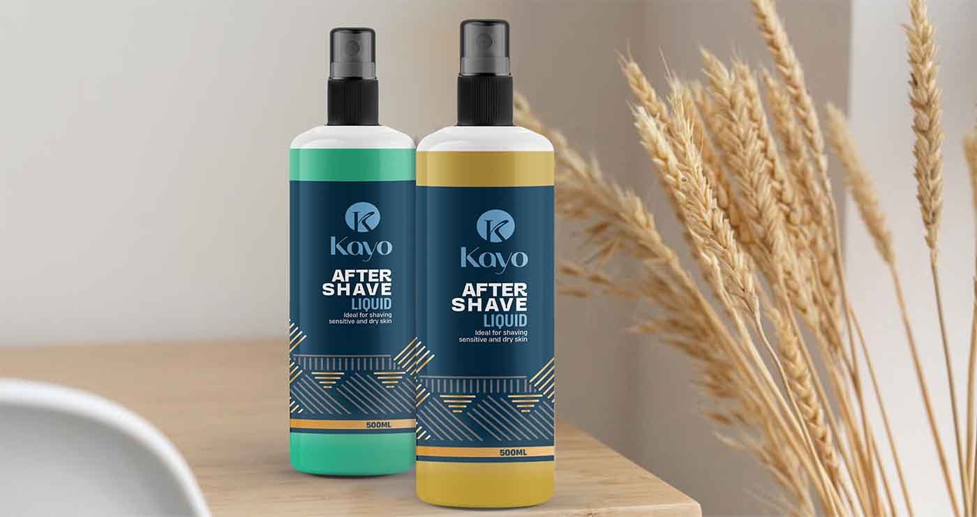
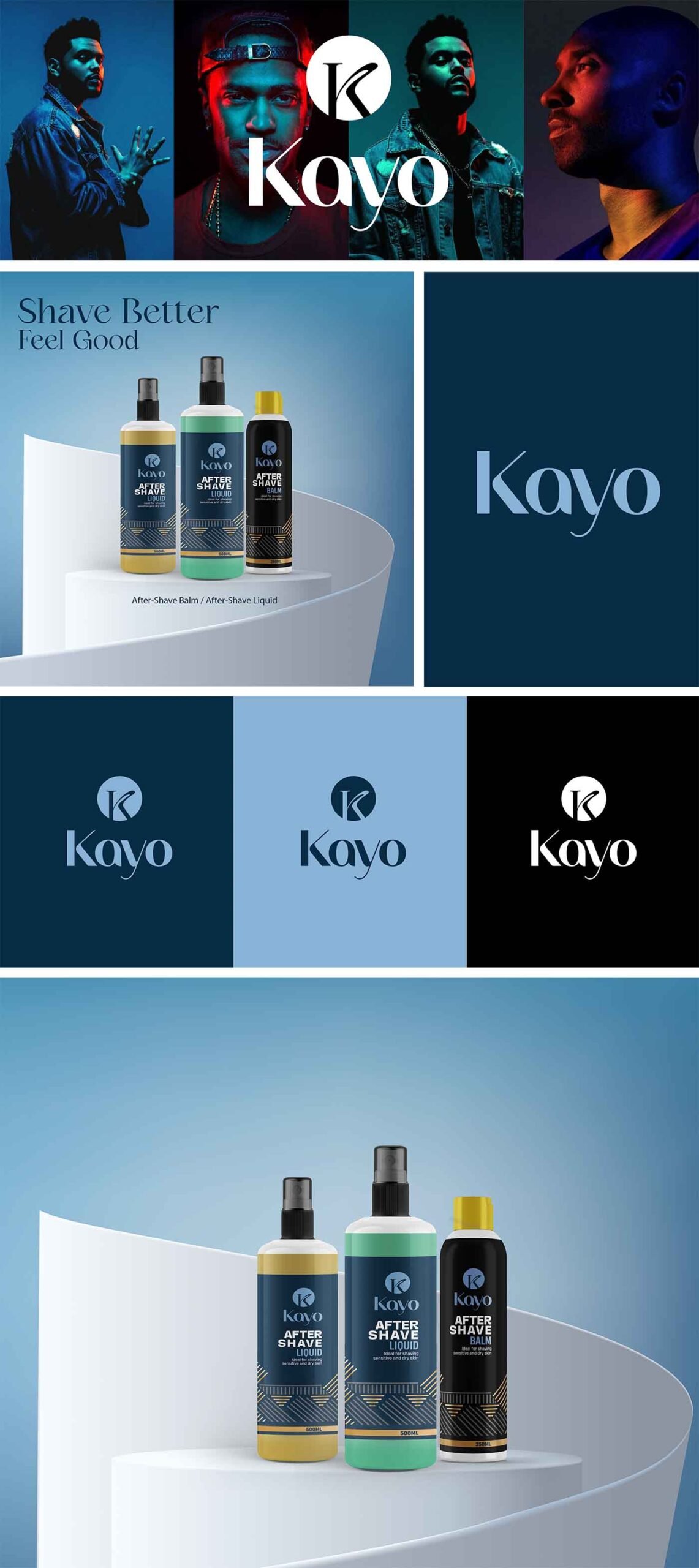
For KAYO we created geometric shapes that form a pattern to emphasize
the concept of balance and protection, as well as a unique, stylized
and contemporary semi-serif typography. We created a monogram that
represents the balance of the concept in a contemporary and minimalist
way to give it a clinical touch. For the packaging we used geometric
patterns that helped create a family of products where the color adapts to
the different types of items that the brand has.